Spotify
Symphony (Concept)
A conceptual redesign of Spotify’s internal Content Ops dashboard
Spotify Symphony is a self-initiated concept exploring how Spotify’s admin teams could manage publishing at scale with more clarity, faster reviews, and stronger quality control. This is not an official Spotify product — it’s a conceptual systems redesign focused on internal operations.
The Pipeline Problem
Spotify’s content operations run on a multi-step internal pipeline — ingestion → validation → review → scheduling → release. At scale, table-heavy tools make it hard to see what’s stuck, what’s urgent, and who owns the next step.
System Backbone
Spotify receives content through three main sources:
Record / Label companies
Publishers and distributors
Direct artist uploads (tested earlier, later discontinued)
Each delivery includes audio, artwork, metadata, and release details. Before anything goes live, assets pass through validation and review steps that ensure accuracy, rights compliance, and quality.
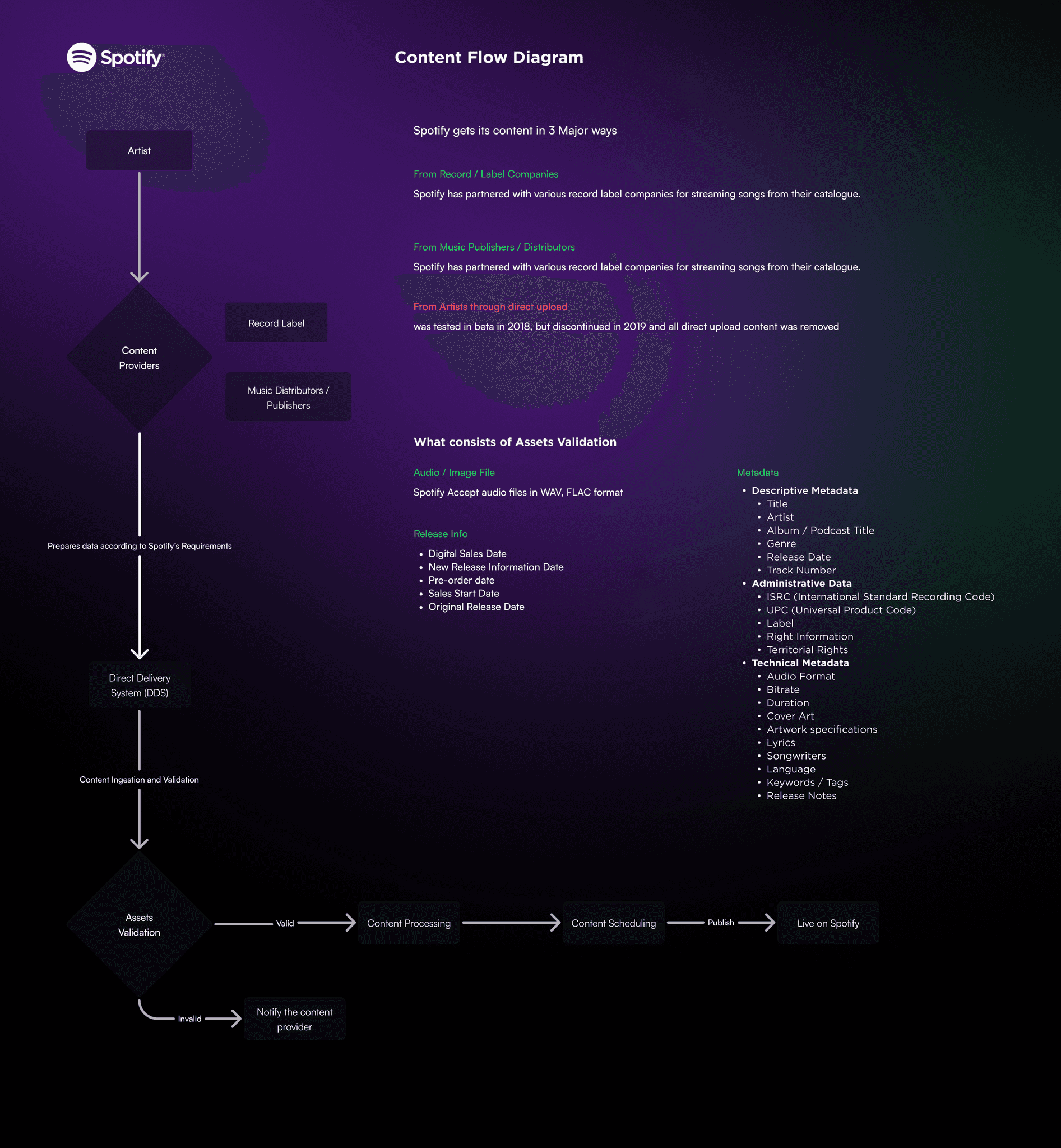
This flow maps how content enters Spotify (labels/distributors), what gets delivered (audio, artwork, metadata), and why validation is critical before publishing.
It became the foundation for restructuring the library UI.
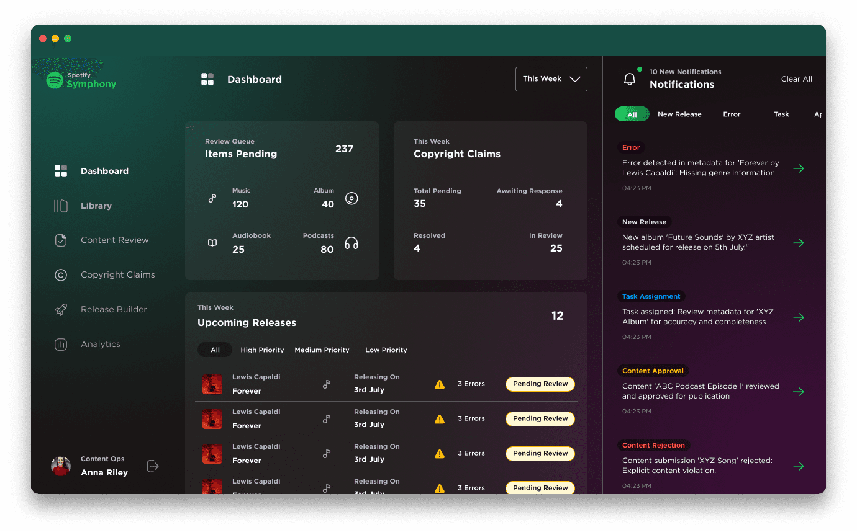
Main Dashboard
The dashboard shows everything the team is working on in one clean view.
You can see what’s new, what needs checking, and what is ready to move to the next step.
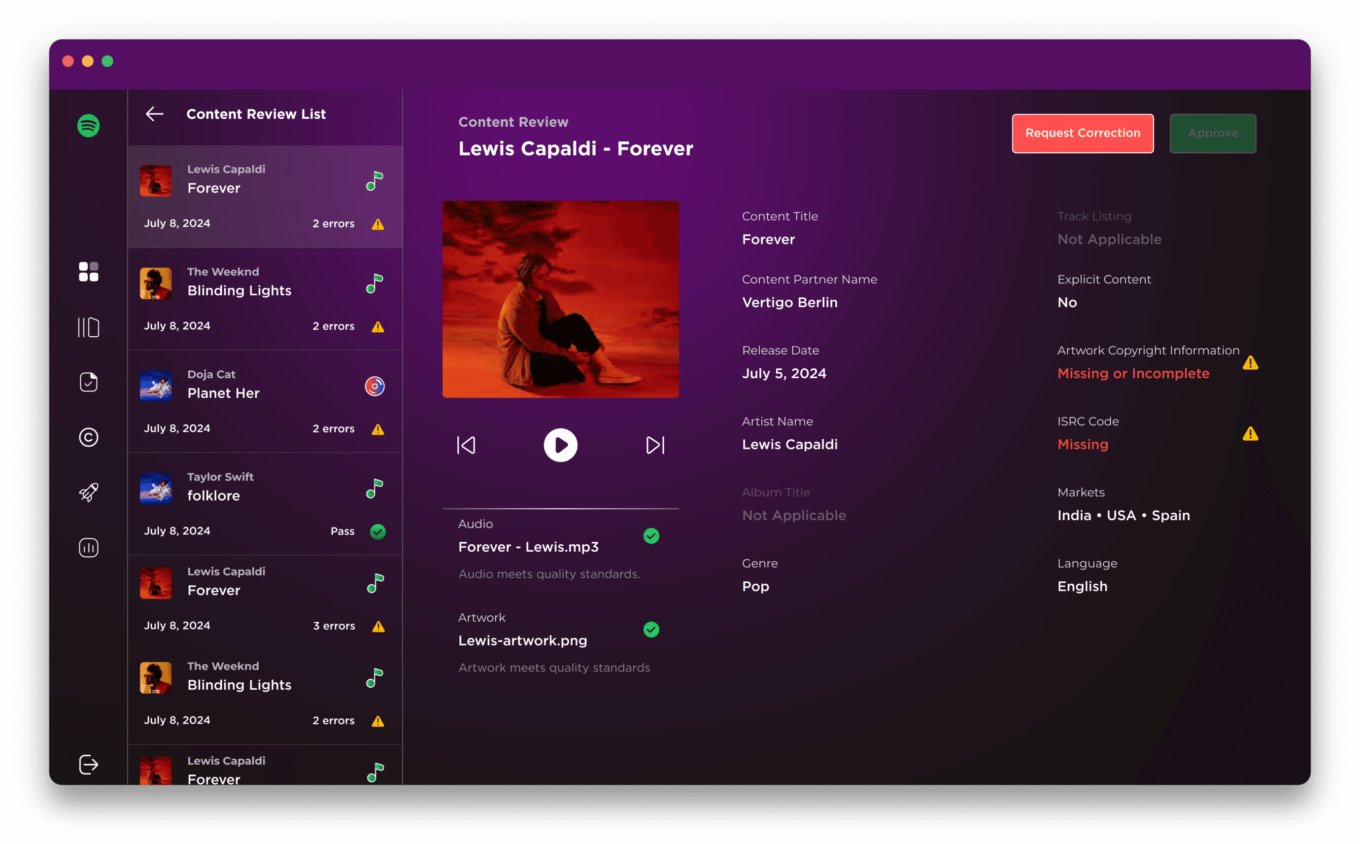
Review Screen
The review screen helps teams quickly approve content or request fixes — without hunting for details.
It highlights items that need attention first, so reviewers know exactly where to start.
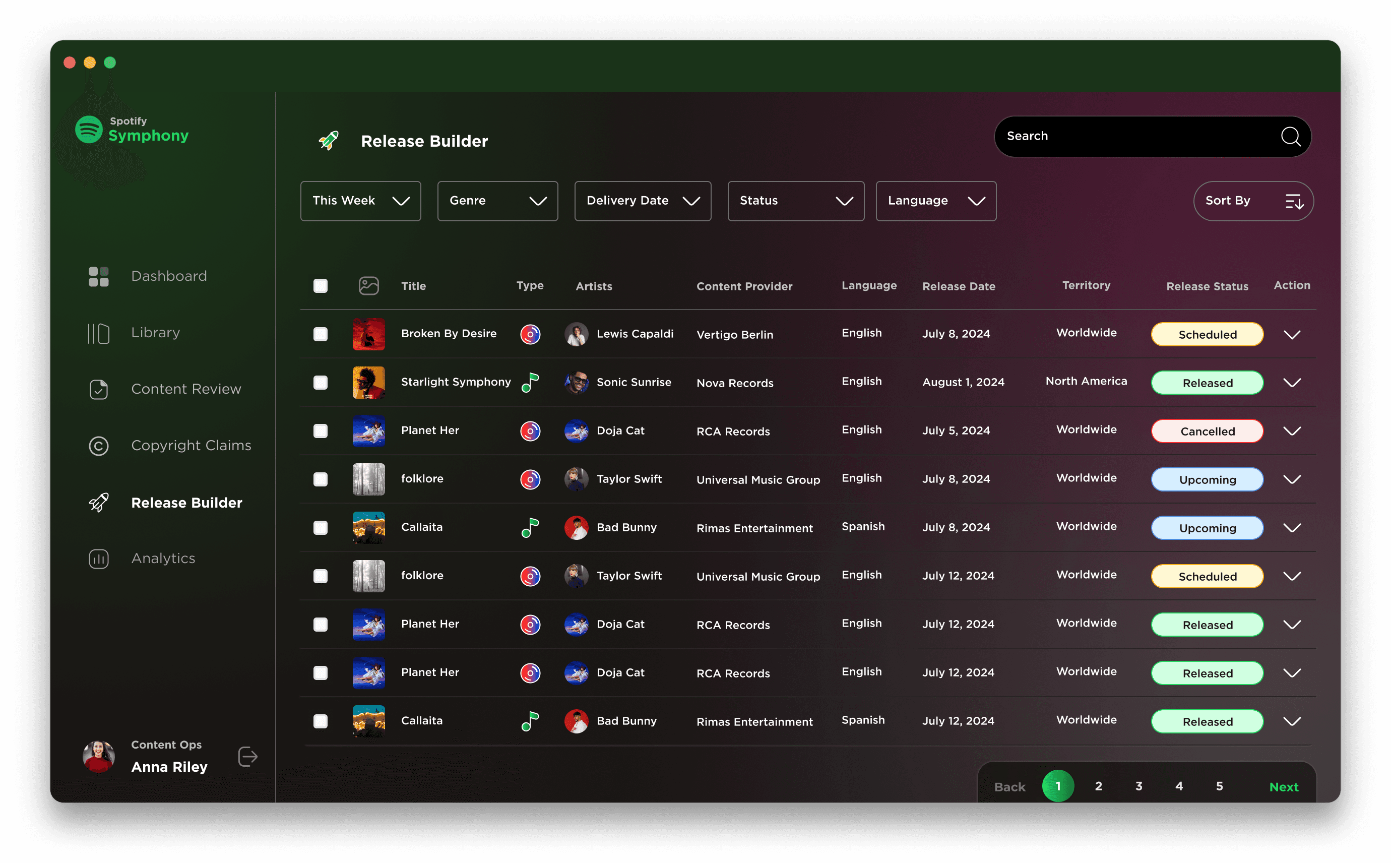
Release Builder
The release screen helps teams schedule when a track or podcast should go live.
They can set dates, hold a release, or cancel it — all in one place.
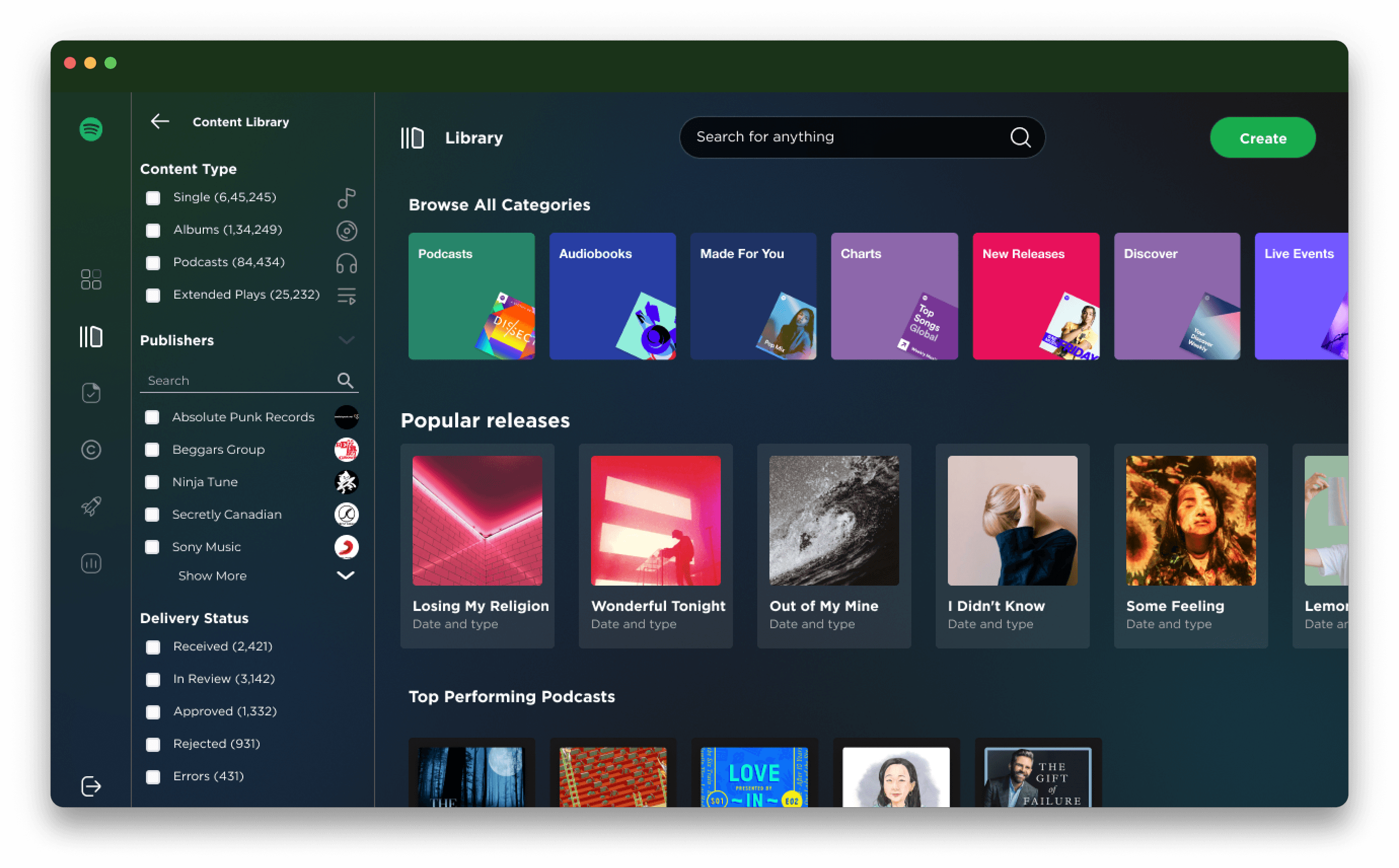
Library
A single place to browse everything Spotify receives — music, albums, podcasts, audiobooks, and more.
Category cards + strong filters help Ops teams jump to the right content type fast, instead of digging through endless lists.
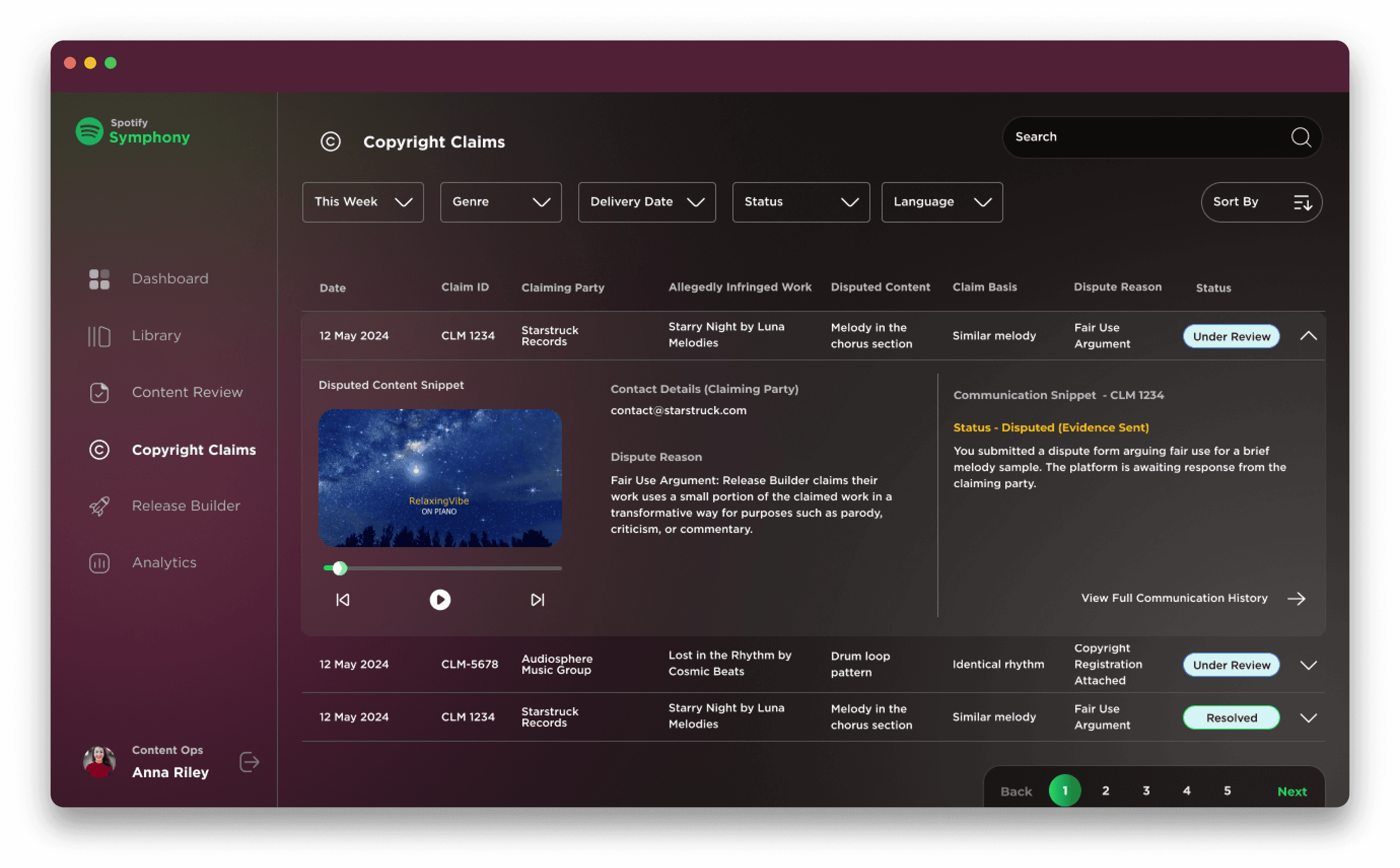
Copyright Claims
A dedicated space to handle disputes and takedown risks.
Claims surface with context (infringed work, dispute reason, comms history), making investigations faster and resolutions traceable.
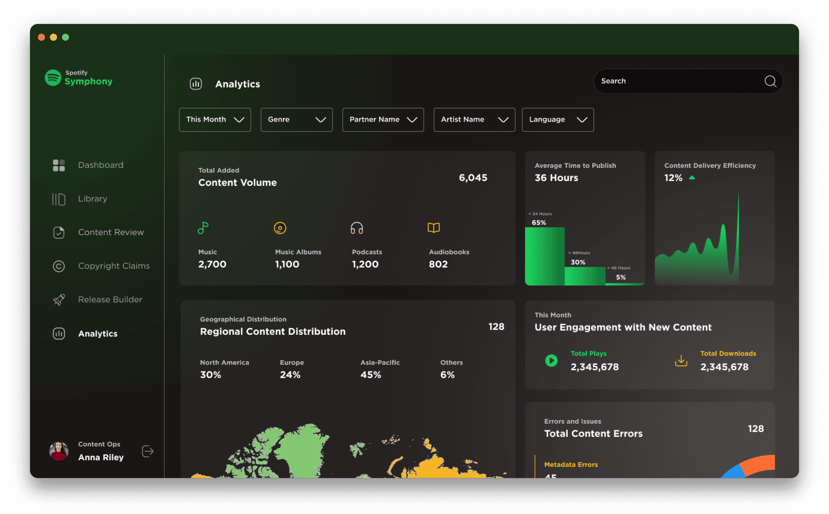
Analytics
A health dashboard for Content Ops performance.
Shows content volume, publishing speed, delivery efficiency, regional distribution, and error trends — helping teams identify bottlenecks and improve reliability over time.
Reflection
This concept helped me explore how internal tools can feel clearer and lighter.
The goal was simple:
make it easy for teams to know what’s happening, what needs attention, and what to do next.
Book a Call
Let’s Build What Lasts.
I collaborate with founders, teams, and dreamers who care about clarity, craft, and lasting impact.
If you’re shaping what’s next — let’s talk.
Schedule a Call
Rhitik